Laura Boswell ARE – Printmaker

Not to worry…

You might have noticed there was no Friday blog last week. Writing came a poor second to printmaking that week and a good deal of the week before, as did laundry, regular meals, exercise and remembering not to hold my breath for long periods. I’m sure you’ll recognise the symptoms of starting a new project and the excitement of running with your ideas to the exclusion of everything else.

For most of my life the failure to provide a Friday blog as promised would be so anxiety inducing that I’d have made myself write one whatever the inconvenience. Letting people down, however distant and virtual those people might be and however tenuous the promise, is a fear I have in common with many others and it’s one that’s easing gradually. I’m sure I’m not the only person to back themselves into a corner by making a commitment while failing to realise that it’s mainly, or even only, me that actually cares about it. I’m guessing you’re OK with this blog missing the odd week or two*. It’s not a huge deal, I’m not writing anything more important than something to muse over while eating a biscuit. I’m getting over it and, if you’re prone to worrying about this kind of thing like me, have another biscuit and drop a few minor commitments too.

The all-consuming project is far more exciting. I am making a set of Japanese woodblock prints of the North Yorkshire Moors.

One of my new Yorkshire prints – rough grasses in a December afternoon dusk.

These prints have demanded a fresh approach and I’ve been rising to the challenge. Ironically these new Japanese woodblock prints owe much to the kind of mark making that’s more a part of traditional linocut, while my recent lino work is fast becoming indistinguishable from the washy transparency of traditional Japanese woodblocks. Contrary, but it’s what’s working for me and now it’s working, I can’t leave the printmaking alone. So this week’s blog was a bit touch and go too if I’m honest.

This week on the Ask an Artist podcast we interview master paint maker Michael Harding who, even as a student, never had any issues about prioritising his love of mixing pigments to the exclusion of everything else, including the welfare of his bedsit and the loss of his housing deposit.

*I did get one complaint from my brother-in-law who wanted last week’s blog to feature my award for the tartan todger. Sorry about that, but the whole story of my early artistic genius concerning the male member is included in last week’s Ask an Artist episode on competitions.

Lights, Camera, Action…

I have been starring in a film of my own life over the past ten days or so. We’ve documented one of my linocuts from drawing to finished edition, the goal being to relax and inform others with a slow film about printmaking, rather than an educational video about specifics. The result is a film that’s as much about the passing of time as it is about technique. We’ve deliberately kept things as silent as we can, bar a couple of snatches from Jane Eyre and Miss Marple before I got into the swing of switching off during takes. I had to shut up too; I never realised how much non-sensical muttering I do until I didn’t.

We both knew it would be tricky. I am viciously impatient of anything that gets between me and my print. Plus, used to being alone in the studio, I’m inclined to trip over (kick) cables, cameramen and tripods.

Look how nicely we are smiling!

Thankfully Mr B specialises in working unobtrusively and never expected me to pretend to do anything just for the camera. The worst he did was to make me wait while he set up shots and ask me to hit a specific mark from time to time. We finished with him imagining that I barely conceded to any of his directions and me knowing that the Pope will be in touch shortly to celebrate my saintly abundance of patience and good will.

Watching the film was as close to an out of body experience that I ever wish to experience and certainly the death of my vanity. There’s no posing for the camera when deep in concentration. In many respects it was an encouraging trade-off. I found it very easy to forget how I looked in terms of appearance because I was so interested by what I could do in terms of print. That said, I gradually found myself thinking that something was missing; that the me on film should be referring to a colour plan, or at least a to-do list, instead of just staring into the middle distance with unbrushed hair. It seemed such an inadequate approach.

We set out to make a film to highlight the time, focus and creativity involved in printmaking and I think we’ve done it. For my part, I’m pleased that watching it has made me pause and appreciate how lucky I am that the colour plans and to-do list are reliably spooling away, hidden inside my head, desipte the unbrushed hair. For everyone else, I hope it says a lot about what goes into making a print and a little about my methods. As for Doris, I can only apologise. She’s a starlet out of control.

This week on the Ask an Artist podcast we discuss writing rather than filming, but you should listen anyhow. The epic print film can be seen on my YouTube channel at Laura Boswell Printmaker for your viewing pleasure. Choc ices optional.

Not just a pretty face

I left my hairdresser recently; other women of a certain age will sympathise. Undeniably talented hairdresser that he was, Bob was somehow just not seeing me anymore. I’m not sure when I went from paying customer with individuality into the big box marked ‘nice ladies of a certain age’ but, just like in Toy Story, there I was. Left on the side of the style road waiting for the nursing home truck. The nail in the coffin came when I said that I didn’t wish to look like a lady who spent her days colour matching towels in John Lewis and he replied that I ‘had the face for it’. He was right of course; I have the pleasant face of the stranger who’ll mind your bags while you nip to the loo. Doesn’t mean I care to pay to be reminded of it. Now I go to Emily, covered in a riot of tattoos, who is far more interested in my trips to Japan and my prints and far less in pigeon-holing me into a one cut suits all.

The sad fact is that I am as guilty as Bob. I once taught a very elderly woman who was struggling a bit in class. I spent a bit more time than usual one to one with her and sorted out what she needed to understand. Then I stupidly said that being in class could be a bit overwhelming and not to worry. I didn’t actually say ‘for a woman of your age’, but I might as well have done.

She smiled kindly and said that she thought the problem was too much time in class, not too little. Handing in the final papers of her doctorate had clashed with my workshop, so she was feeling a little tired. I’m grateful for that humiliating lesson in teaching me that people are very seldom who you think they are. Can I put in a word here for a similar re-education programme for mobile phone sellers? I’m tired of having my ignorance interpreted as stupidity and I’m sure many feel the same. I’m ignorant about phones because I can’t be ars*d to be interested, not because I lack the intelligence to learn.

Appearances can be deceptive. We all know that and we all forget it. This week on the Ask and Artist podcast we’re discussing social media, the most misleading light ever provided to shine on our personal and professional lives. Surely social media is the greatest villain for misinterpretation the world has ever seen. Or is it?

All the towels in my studio are coordinated to match with equally inky filth

For me as an artist it is the exact opposite and I hope that’s true for most creatives. It’s a platform for my reality. A world away from predictable ‘niceness’ of my age, face and clothes, where I share just who I am and what I can do. I’m good with social media and I believe this is mostly down to authenticity and honestly. That the audience like my output is fantastic, but that I have a place to put the output is even better. Look on social media and you’ll see the truth: in my world, towels are ripped into squares and dunked in ink and spirits, not politely matched to the colour of the downstairs loo.

What goes around comes around…

I spend a lot of time on social media and on my web site telling people all about what I do and how I do it. I’m quite happy, indeed enthusiastic, in sharing knowledge. I am very pleased to share. My family and non-printmaker friends will tell you how pleased I am. They’d just roll their eyes and look exhausted while doing so.

I’m not alone in this. I have just visited two paint and printing ink manufacturers to interview for the podcast. They are going to be long episodes. Far from wanting to control the podcast around promoting products, both companies revelled in sharing ideas, methods and helpful hints. Both challenged artists to get in touch; ‘the harder the questions the better’.

Sharing techniques and materials has never been a problem for me. Printmaking is very process-led and that means plenty of lovely tools, materials and methods to share. Aside from that, I feel a debt of gratitude to people who helped me along the way. Passing on my knowledge to others is simply keeping the chain of generosity intact as I go from novice to experienced printmaker. I believe generosity in the art world is pretty common, here are a few of my experiences.

I’ll start close to home with my in-laws. My lino tools were given to me to take to art school by my now mother-in-law and former illustrator Sal, whose father James Boswell used them for his own prints and for illustration jobs of all kinds.

My mother-in-law Sal painted by her dad James Boswell . I love this painting, she’s less keen.

They are beautiful professional tools that she entrusted to her son’s 18 year old girlfriend of a year who was about to vanish over the horizon to Aberystwyth University, possibly never to be seen again.

Paul Hogarth, the illustrator, who I met in passing and who took time out to chat and to tell me exactly how hard I would need to work and how much passion was needed to become an artist. It took me many years to realise how sensible and realistic he was and to see how much he didn’t need to waste time with a twenty-something shilly-shallying between a paying job and trying to make it as an artist, but he did so anyway.

Old Mr Lawrence of Lawrence Art Supplies who apparently had all the time in the world to discuss Japanese papers and printing inks in his shop in Bleeding Heart Yard and who treated me like a serious artist when I was anything but.

Ian Phillips, linocut printer and member of Pine Feroda, who told me (when I began printmaking in earnest in 2005) to stop thinking of myself as a woman with a shed and a hobby, to grow up and start behaving like printmaker with a studio and has given me endless helpful advice ever since.

The list goes on, but I am sure you get my point. What goes around comes around and I’m very happy to be a part of that process.

This week on the Ask an Artist Podcast we are celebrating Christmas by discussing the many ways of giving back to other artists, the local community and to our supporters. The podcast is released weekly on Fridays at 10am GMT

The Artist’s Persona

I do like a personality quiz. There’s something appealingly Daliesque in discovering the public building that most represents my taste in men, or which Jane Austin book reveals my secret sporting ability*. Surreal answers aside, the one fixed point in these random tests is my high score as an introvert.

If life consisted of hiding in the studio and pretending to be otherwise occupied when required to speak to anyone other than the studio spiders, introverted is all I would need to be. I’d have a considerable talent for the task. But most of my time is spent in front of other people; teaching, chatting, selling and generally being a pleasantly outgoing and engaging person. Indeed, my livelihood depends on it.

Keeping calm and carrying on!

Fortunately, connecting with people is a skill that can be learned. It’s terrifying, like most extreme sports, but comes with practice. I made it a rule, when I started out as a printmaker, to engage with strangers whenever I could. Not in a mad person on the bus way. Think more inept British person breaking all bounds of normality to mumble something about the weather. I still make myself do this to keep my hand in; take away the art and I’m back to staring at my shoes and avoiding all eye contact.

Over the years I’ve actually come to love this duality and my outgoing role as an artist. I like meeting people, hearing their stories, coaxing lovely prints out of students and taking part in shows and fairs. I weirdly adore giving public talks about my work: an evening all about me and a chance to show off in public, what’s not to like? Turns out that inside the introvert, there’s a borderline extrovert waiting to break free. It just takes my job, backed up with some hard core training, to make the switch.

Ask an Artist podcast explores the artist’s persona this week, the how and why of developing a professional public face. Have a listen and tell your friends – we’d love to have your company

*
• Tate Britain/talented (obviously)
• Sense and Sensibility/downhill running with mixed success

Understanding Galleries.

I have a gamekeeper turned poacher feeling about galleries. I had a similar sort of job working in a picture library in the nineties and the overlap has stood me in good stead when it comes to understanding and working with galleries as an artist.

I used to manage a collection of child development photographs, the work of about ten or so professional photographers. There’s much I could tell you about alternative methods of childbirth and developmental milestones. Instead I’ll tell you that looking after those photographers and managing their work was more than enough labour to entitle our business to the 50% we took from any sales. Hopefully no artist would arrive at a gallery with a big smile and several carrier bags packed with uncut and rapidly unspooling ribbons of film as my photographers often did, but still the workload for any serious gallery is huge and the responsibilities equally demanding. And that’s just the behind the scenes work, not the selling.

My time managing the baby photos taught me not to be sentimental. I needed to send out photos that would sell, not photos I liked. Among the hundreds of babies, it was easy to spot that my son Jim was the winner; clearly the most intelligent and beautiful child on file. That didn’t mean he’d sell for every job.

My lovely Jim, cover boy for Mothercare during the boom years…

When I sent my photo selections to clients they were based on sales, not mother-love, and he often didn’t make the cut. Remembering this when a gallery turns me down or returns work unsold helps to remind me that rejection isn’t personal, just a practical decision based on sales and not to take it too much to heart.

We loved our photographers, crazy and demanding creatives that they were. We welcomed their visits, drank tea, shared lunches and took time to truly understand their work and methods. I don’t expect every gallery to supply lunch and tea, but I’ve no time for any who have no time for me. A good gallery never makes an artist feel it’s a favour to take their work and, if they don’t mind, could they use the back entrance and be quick about leaving. Without the artists, there is no gallery and without taking time to understand the artist’s work, selling must be close on impossible. It’s not often I walk away, but I did the day a gallery owner greeted me with ‘love your work darling, now remind me which ones of these are yours?’

On this week’s Ask An Artist podcast we talk all things gallery, don’t forget to subscribe!

How it’s made: reduction linocut my way…

I thought it would be interesting to write a blog explaining exactly how I make one of my linocut prints. This print, called Vale Raking Light is a great candidate for a thoroughly nerdy piece with plenty of technical detail and hopefully some helpful ideas.

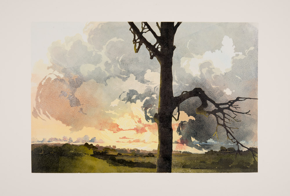
Maybe take a quick quiz to see if this blog is for you before you go on reading: you meet a person at a party who begins talking about the rag content of paper. Do you a) wonder in bemused horror how much scraping your host had to do at the bottom of the social barrel to come up with this freak or b) glow with pleasure as you give up the next two hours and all pretence of socialising while you pin down why Somerset may or may not trump BFK Rives. I leave you to judge, depending on your answer, whether to read on or not…

Raking Light is a reduction linocut using traditional artists/battleship lino, printed in oil-based inks onto Fabriano Rosaspina paper using an Albion printing press. By reduction printing, I mean that the whole print is created from one piece of lino (which I’ll refer to as the block in this blog). After each layer of colour is printed, more is cut from the block until the print is finally finished and the block destroyed. This print has fifteen layers of inking in all.

I use Intaglio Printmakers oil-based inks with the addition of their extender and cobalt drier. Extender adds transparency to the inks, like adding water to watercolour paint. A scant drop of cobalt drier to a tablespoon of ink will speed the drying time of oil-based from days to hours. I use oil-based ink because I find it much more sympathetic to colour mixing: what you see is what you get. With water-based ink, the colours look edgier and often darker on paper as opposed to the mixing slab and can look chalky with the addition of white. Importantly I can work light to dark and, less conventionally, dark to light with oil in ways impossible in water-based ink. I also avoid the danger of the paper cockling with damp ink. This can be a problem with water-based inks, especially since I often work with many layers of ink.

Raking Light began with a sky spotted from the car. I lurched to a halt on the road into Aylesbury and took photos on my phone. Usually I make sketches too, but not this time, not on the A413. I used these photos to work up this design drawing ready for transfer to the lino.
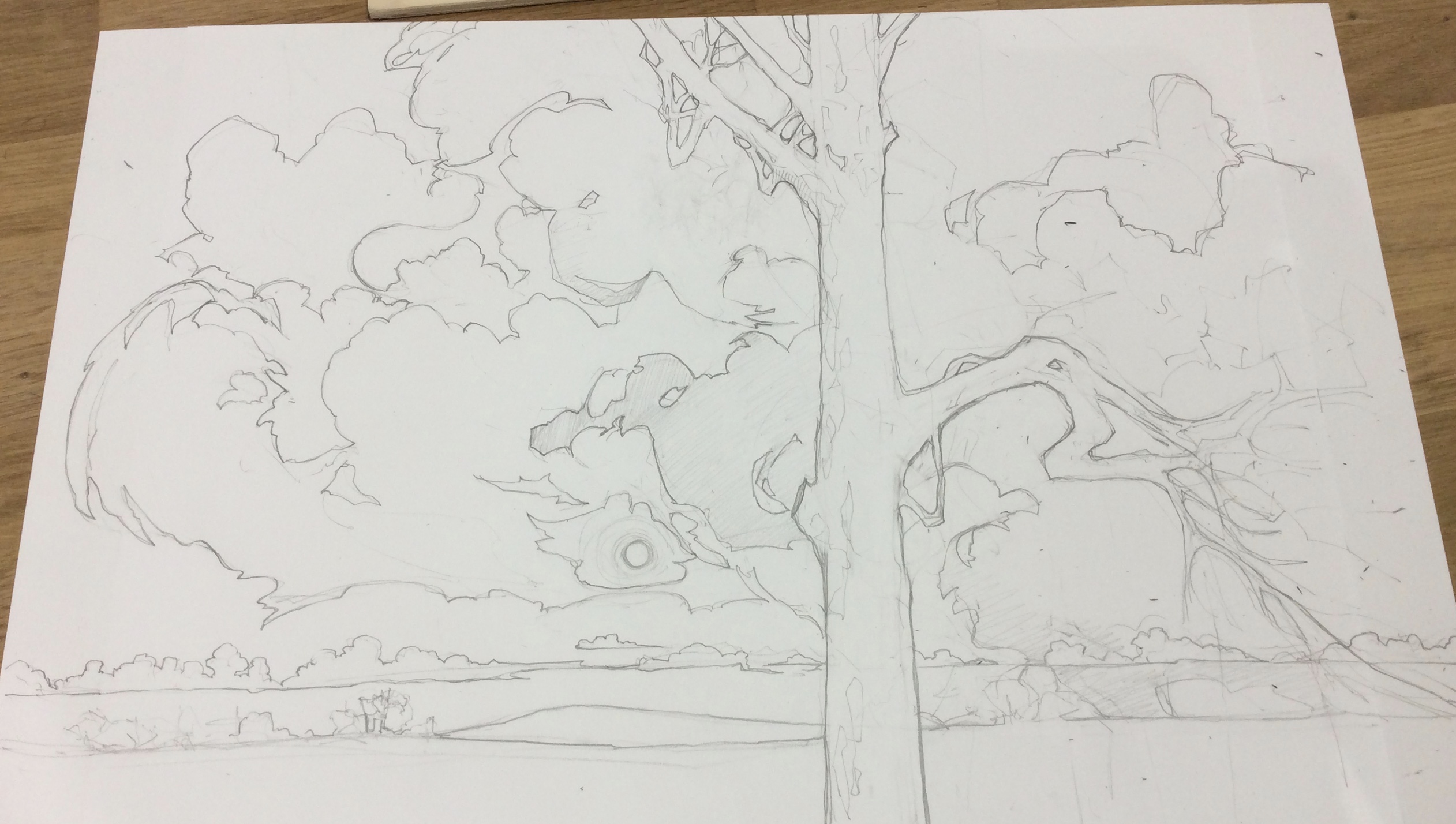
I assemble my landscapes in my studio with the help of source material. I’m far more interested in catching the feel of a place rather than making an accurate representation of a specific location. That way the viewer is free to make the landscape their own while I, in turn, am free to arrange the composition to my own satisfaction. You’ll see the land change shape later as the print progresses.

I made a tracing from my drawing to transfer the lino to the block. I use Polydraw plastic tracing film for all my tracings. Polydraw is completely stable, no swelling or cockling even if it is splashed with water, unlike conventional tracing paper. I flipped the tracing over to reverse it (so that the print would appear in the same orientation as the design drawing, rather than as a mirror image) and transferred it onto prepared lino using carbon paper. I prepare my lino by giving it a light sanding with fine sandpaper to key the surface and then stain it with red ink much diluted with white spirit. I wipe the dilute ink on with a cloth, leave it for a few minutes and then rub off the excess and wipe over with white spirit to finish. The carbon paper I use is office carbon and it can transfer to the print unless it is treated. To prevent transfer with oil-based inks, I leave the carbon to ‘set’ for an hour or so and then wipe over thoroughly with white spirit. This reduces, but doesn’t prevent, transfer when using water-based inks, for those I suggest making some sacrificial prints to allow the carbon transfer to fade before starting to print properly.

This photo shows the lino with the first layer of ink applied for printing. I used a combination of different rollers to apply the ink. Here I have at least three rollers on the go and am inking only where I feel it is appropriate. With this approach, you can either just add more ink between each impression, accepting that the image will become softened and blended with each application, or you can wipe down the block between each print so that the painterly application of ink is fresh in every print. I dot between the two methods depending on what I’m doing.
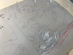
This is the lino showing my early cutting. The red is chinagraph pencil and the blue lines the carbon. I used the chinagraph to resolve the landscape as I went – it changed significantly right up until the end of printing thanks to how the work developed. I may start with a design drawing, but it is never set in stone and I often change and adapt as I go. I never make a colour study or plan of any sort either. This seat of the pants approach means I am constantly responding to what the work needs rather than being restricted by preconceptions.
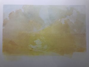
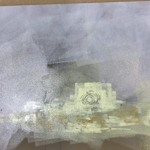
This is an early impression showing the mix of roller-applied colour in the sky. The ink is mixed with extender at about 95% extender for great transparency. Using so much extender comes at a price: it can make the ink sticky and stringy, flicking it up onto the bar of the roller where drops can drip back down onto the print (solved by keeping and eye out and wiping down regularly). This dilution also requires a good deal more work with the roller on the lino than normal to even out the ink if you want a smooth transparent layer. I use a little ‘tack reducer’ added to the ink to make it flow better and be less sticky. Tack reducer looks like Vaseline and a small amount added to oil-based ink will help it to flow on cold days and eases the stringiness of extender-heavy inks.
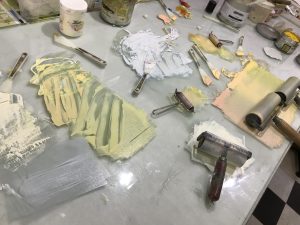
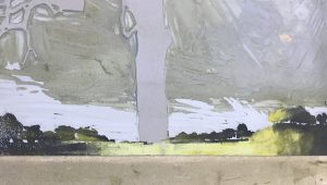
Here is my slab showing the various colours and rollers. I always mix using the previous colours as a part of the new colour. This started out as thrift in my student days, but now is more a matter preference for a harmonious palette.
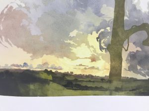
This picture shows the build up of the sky, very transparent and painterly. I enjoy the contrast between the definite cut line in my work and the vagaries of my inking. This makes for an edition where the prints all share the same colours and cutting, but the application of the ink varies. I have no issue with this, making numbered photos available for clients and galleries to select their preferred prints and have never had a problem commercially. If I reach a point where the variation pushes the notion of an edition too far, I will sell the prints as a series.
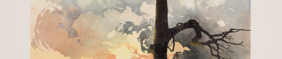
This series of photos shows the build up of the landscape. The land remained a quandary and, if I’m honest a bit of an irritation, until I started work on it, then it became my favourite part of the print. The first couple of layers of land had almost as much extender as the sky to give it luminosity, but as I got closer to the foreground, I reduced the extender to less than 20% and then removed it all together for the last couple of layers. I didn’t decide what to do about the tree until the end, but kept my options open by putting on some ink at an early stage to see how it looked. I didn’t ink the tree at every stage so that it would stay crisp and detailed when finally printed. I always avoid over-inking areas of fine detail if I can.

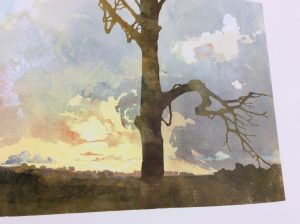
These two photos show the lino with a painterly application of bright ink that is going to print over dark ink, then the subsequent print (see how I am now ignoring the tree). While oil-based ink makes it possible to work light over dark, you need to make the lights overly bright, as the darker base layer will always knock paler ink back and subdue its tone on the print itself.

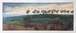
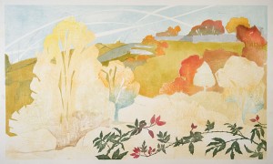
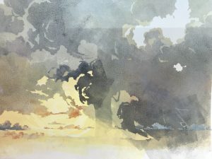
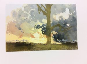
Below is the final result again showing the finished tree which I printed in one hit, highlights and all. I began with fourteen pieces of paper and ended up with fourteen finished prints. This takes a good deal of experience and nerve.

The reduction process doesn’t allow for test proofing or going back and printing more. If you are new to the process, either allow yourself some extra prints for mistakes or accept you could end up with a very small edition (I do remember going from twelve down to one back in the early days, necessitating a cry and probably some chocolate biscuits).

If you want to see the variation in inking you can look at the prints in succession here. Better still, if you’d like to buy one, click here. If you want yet more advice insight and help, you can scour my resources pages here or join me on Facebook or Instagram where you’ll find me as Laura Boswell Printmaker.

Don’t try this at Home

Mounting Japanese woodblock prints and what not to do!

So, what do artists do all day? I’ll give you a snapshot into this morning…

Today I discover that an experiment I made in backing a pair of prints with a sheet of paper to unite them flat for framing has sort of worked. Sadly the bit that hasn’t is quite important: the prints are desirably flat, but the backing paper is now tightly bonded to the glass sheet I used to support the experiment.

This is a bad thing, but not insurmountable. True these are finished prints and they are now stuck fast to the wrong thing, but they are Japanese woodblock prints. This means I can sit at the kitchen table with a bath sponge and a bowl of water and dab them until the whole thing is wet enough for me to release. Japanese watercolour and rice prints look delicate, but take damping and re-damping with the insouciance of the British at a bank holiday barbeque. I have two more sets of prints to go and another avenue of mounting needs exploring.

I learned the art of backing prints with supporting paper while on residency in Japan. Imagine the scene: a big room empty but for tatami mats and sliding paper screens, Mount Fuji at the end of the garden and students kneeling attentively (this does not include me. I cannot kneel and used to carry a note excusing me from kneeling in infant school. I stand respectfully instead). What the master says makes absolute sense and we accordingly mount and back prints successfully. What doesn’t translate, once I am in my own kitchen, is the access to the right brushes and papers. Here I am lacking in wide hemp, rabbit and deer hair brushes and the easy availability of washi paper. My prints are on European paper and I have emulsion brushes from the builder’s merchants. It’s now a question of adapt or fail.

This time I decide that the glass is best lined with cling film to prevent the backing sheet from sticking. I have seen Masterchef: I know cling film has diverse uses. First I wash the big sheet of picture glass in the bath to remove the last batch of gummed paper. As the glass slips around, I consider the health and safety forms I’ve just filled in for a class I have to teach. They require me to warn students not to trip over their own belongings. Nowhere do they cover the stupidity of juggling large sheets of thin, wet glass in a hard, curved bath.

I and the glass survive. Lining with cling film goes well, but then I worry the gummed tape to stretch the paper won’t stick so resolve to cut the film to the size of the paper to expose glass to the tape. For some reason I choose to use a meat cleaver for this (I am in the kitchen after all). More suited for a father intent on discouraging his daughter’s admirers, it actually works a treat and I am able to put fresh paper onto the film on the glass, damp and stretch.

The prints need to be stuck down with rice glue. I’ve made the glue by beating the hell out of a stiff rice and water paste for a full half hour over high heat while wondering if this is for the glue’s improvement or mine. Traditionally the resulting rubber ball is then diluted again by working with a hemp brush. I use the milkshake option on the blender. The cat appears and walks about on the prints. I shut him out. He swings on the door handle and yells, so I stop and place a chair in the sun where he agrees to sit and assumes the expression of Prince Phillip watching some not-so-good tribal dancing. I coat the back of my second batch of damp prints with the rice glue and offer them up to my scrupulously drawn guide lines more in hope than expectation. When they were handing out accuracy, I veered off course into the queue for creativity. I do my best, seal everything down and leave with the cat to dry in the warm.

It’s not yet nine am. This is a pretty normal day for me and I suspect for a lot of you creative people. It’s what we do and, though it’d be nice if things ran to plan, I do like a job that keeps me on my toes…

Des Res

In a week or so I will be setting off to Japan for an artist’s residency of several weeks to further my Japanese woodblock printing skills. At present details remain sketchy: I know I am the British artist, but don’t know who my four other companions are or which countries they will represent. Interestingly this worries me far less than the thought of crossing Tokyo. Printmakers always have plenty in common; I and the noodle sprawl of the Tokyo subway less so…

On the face of it, an artist’s residency seems like a bit of a jolly. Five weeks to indulge. Indeed, ‘aren’t you lucky’ is something I have been hearing on a very regular basis. I wouldn’t argue with the fact that I am lucky, but what I see as luck may not be the same as the luck implied in the comment. Artists like me have the luck of possessing the drive to stick with a technique and work through the catastrophes, goofs and setbacks to get to a point where we can be good enough to be considered for residencies. After that, luck is out of the equation: selection committees select, they don’t tend to pull names at random from a hat (at least I’ve never been on one that’s done that, however dull the evening and close the pub).

The residency also brings responsibility. I am giving up earnings, cancelling a workshop or two and putting family on hold to go out there. I’d better have something to show for it when I get back. I’m gambling that five weeks far from my comfort zone will result in a move forward in my work. I don’t doubt it will be a marvelous trip and I am certainly not asking for sympathy. I’m more explaining that a residency has to mark a point of change for my work or I will have failed and not be lucky at all: I’ll just have been self indulgent.

Behind the scenes

Registration problems, sometimes it all goes wrong…

Like most people, I do try to present a fairly polished front to the world when it comes to my work. Certainly I do my best to be organised and efficient at the admin end of the business (investing in a desk and a filing cabinet has been a revelation and I am pathetically thrilled by having a basket on my desk with stapler and sellotape to hand. Scissors still elude me despite bulk buying, but we can’t ask for everything…)

The upshot of all this is that I tend to only show the good bits of my work: the neat little sketches with potential, the studio shots where I look in control and am not squinting at the camera in a confused leer and, most of all, finished prints. For a change I thought I would show you some heart ache. Things don’t always go well and this print has been a really good example of what can go wrong. Inevitably this was the last print in the series of fourteen due for my client with a deadline looming and almost as inevitably I developed a head cold featuring a dangerously drippy nose at the same time.

working proof showing how things shouldn't look
working proof showing how things shouldn’t look

Japanese woodblock relies on a series of registration slots called Kento. These slots are cut by chisel onto the wood along with the block for printing and are crucial to lining up all the layers of the print into a full coloured picture. They act as a guide and the printing paper fits into them and is held in place to take the impression. Get any of the Kento slots a couple of mm out and the picture will be wonky. The print here has 18 different Kento slots (some of the blocks share a Kento, there are roughly 45 to 50 different woodblocks for this picture) and somewhere along the line I was out of sync.

Trouble is that it isn’t until I start printing that the problem becomes clear and even then it is seldom obvious just which kento is the problem and with several blocks sharing a kento, it could be just one of them that is out of line. The paper doesn’t make things easy either: it must stay damp, consistently the same damp, or it changes dimension. The bigger the print, the bigger the distortion. This print is 120cm wide and the paper can change by as much as 4mm as it dries. It’s easy to control if all goes to plan, but have a head scratching crisis of alignment and the paper is against me, drying out as I try to see the break in the chain of Kentos and adding to the confusion.

In the end I did manage to get a finished print without the benefit any drips from my leaking nose, but it was a nightmare.

DSC_0234I would love you all to think that I have everything under control and things always go to plan, but it’s not the case. I do get caught out, as I have here, and I am far from perfect. It’s just that I tend not to talk about it much!