Laura Boswell ARE – Printmaker

Saving Paper

What is washi?

‘It’s only paper’ is something that I say to my students on a fairly regular basis; at least to the ones who are reluctant to commit pen to paper or paper to woodblock. However, here in Japan, paper is never really only paper. Paper here has significance from the architectural to the spiritual and perhaps the most important paper of all is washi.

Without plunging too deep into the science, washi is more akin to fabric than paper. Consisting of a tangle of long bark fibres, usually mulberry (kozo), it is phenomenally strong and remains so when wet (forget about advertising claims for kitchen towels which, trust me, are as tin foil to sheet steel in comparison). It is this strength and good natured love of the damp that makes it the perfect paper for water based Japanese woodblock.

Washi papermaking is very skilled and demanding work

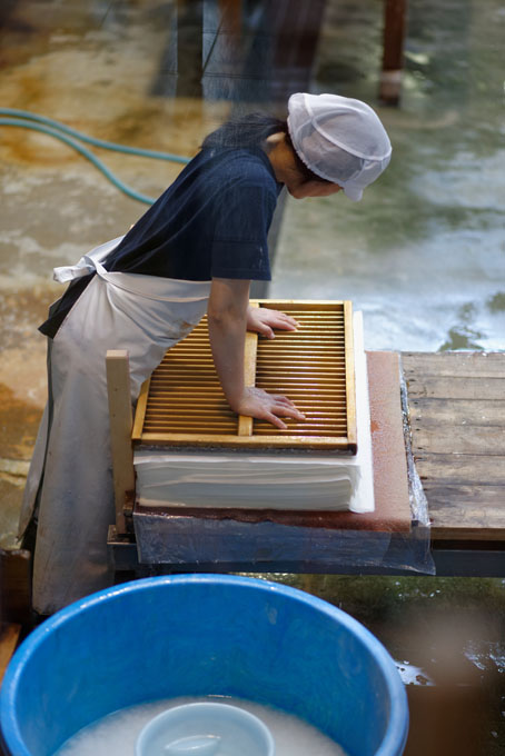
As with all things, there’s a catch. Washi paper production is not easy. Hand made washi production even less so: it’s a brutal and demanding process. Bark has to be harvested, steamed, stripped, cleaned, picked over, beaten, mixed, formed and so forth. Mostly this seems to happen in the bitter cold, the only relief being the opportunity for a scalding when steaming the bark from the stems. It’s a huge tribute to the paper makers of Japan that there are still small concerns producing washi by hand among the more industrialised makers. One antidote to this hardship is the importing of bark fibres from China and Thailand where others get the chilly job of harvesting and processing. Except it’s not so chilly. Warmer climates means faster growth and softer fibres, changing the nature of the paper itself.

Throughout this residency I have been printing on a wide variety of marvellous hand-made washi papers. They bring a luminosity to the print: the pigments entering the fibre itself and becoming one with the paper. I’m under no illusions: I won’t be able to get anything approaching this quality and weight of paper in the UK. Not yet anyway. But it doesn’t have to be like that. In 2014 there will be a Washi Fair at the International Mokuhanga Print Conference. I hope to encourage a UK paper stockist to visit with me to see beyond the small range of papers now available in the UK and to help in the ongoing work to support washi paper makers and to create a stable, affordable supply of these excellent printmaking papers for the future.

Sale of the Century

Being hard nosed about prices.

I’m always a bit worried by cultural stereotypes, trying to define people by nation or class always seems a bit ‘them and us’ to me. However, if there was ever a truth about me it’s that I am hopelessly English middle class when it comes to talking about money. I am overcoming this by blog therapy as those of you who read my blogs will have seen. I can be very brave behind a keyboard. This time it’s about discounts and cutting prices.

I do occasionally get asked to cut my prices by potential clients and this is an interesting one. Thanks to my absolute Englishness about haggling, I get all squirmy. Well, my toes hidden in shoes do: never, ever squirm visibly in front of the client. Below are my thoughts; not just or for those of us who also a) listen, however intermittently, to the Archers and b) like marmite (no really, knife from the jar, like it), but for all who struggle with being upfront about money with clients.

My best advice here is to think long and hard about this before you get into the situation and make your decisions in advance. Bit like writing ‘I do not want a rubbish time share apartment in Marbella’ on your hand in indelible ink before going to collect your amazing free gift, this gives you rules to follow which will save you getting flustered on top of the toe squirming.

My decision is to not give discounts on the whole. My work is priced very fairly for the labour and skill involved and it is priced the same wherever it sells, so that the client never has to worry they are losing out. I would also point out that for every one person who wants ‘a deal’ there are lots of people, including those who collect, who never have asked for or expected a discount. If those lovely people don’t get a deal, why should a stranger get a better price? What I will do, and to me this is one of the most pleasurable things about being an artist, is to occasionally give away a print. This takes people by surprise and I get to choose who gets one and what sort of print they get.

Rules, of course, are made to be broken, but I try never to be hassled into breaking mine. I will give a discount of 10% very occasionally for someone buying more than one expensive print if I think there is good reason, taking the loss on the frame and not the print. I also agree to allow galleries a bit of ‘wiggle’ room as they have to be a judge of when it is prudent to discount work slightly, though not across a sale of work by several artists where the only winner is the gallery.

My final comment is that the sort of people who hassle you for discounts on the ‘oh but we love your work and will buy lots more’ card almost never do. If they are an exception to this truth, regrettably there’s another disagreeable truth about them: they will always want a ‘deal’ on the basis that they are now your ‘special’ clients.

This is only my take on discounts. You may embrace a whole other system. The big point here is that you make the rules about your work and you’re allowed to do that. It may mean ignoring every fibre in your cultural soul, but firmness about pricing is best.

(Remember you can always have a nice hot cup of tea to soothe your nerves after they’ve gone)

Triumph and Disaster

Observations on bamboo paper.

At Art in Action I met a chap called Chris from Hahnemuhle paper and was able to pester him about the bamboo paper his company makes.

I’ve gone on about paper before: in an ideal world I would be using traditional Washi paper for my watercolour Japanese woodblock printing. Unfortunately this mulberry bark paper is affordable in Japan, but quickly becomes unaffordable here. At the thickness and quality that I want, it would really be more economical to employ a Saville Row tailor to hand stitch fifty pound notes into printing paper.

So I thought that perhaps Hahnemuhle’s bamboo paper* was worth a go. Normally I use Fabriano, either Academia or Artistico (both 200g) depending on the size of my work. It works fine, but bamboo sounded so much more fun. Besides which, Chris was really kind and gave me a large pad for experimenting. Art in Action was in July and I have finally got around to giving it a go. I’m gutted: it doesn’t work. It really, really should work, but it doesn’t take the colour smoothly. This is akin to my disappointment over eating dhal: I love lentils, I love Indian food, but I somehow hate dhal. There’s something wrong with the world order somewhere…

However, there is a silver lining to the story. The bamboo paper, almost a thick card, takes the Intaglio oil based relief inks I use for linocut printing superbly well. For those who like the ease of oil based inks, but admire the matt quality of water based inks, this paper takes away the shine of the dry ink giving it a subtle sheen at most. The other really great plus is the reduced drying time. I do use a cobalt dryer to speed up ink drying, but the inks on this paper were dry within a couple of hours, allowing me to get two layers of oil based printing done within a working day. Coverage is good too, no extra inking, though as always I sanded the lino lightly before printing. It’s a great paper for a lush heavy matt print, though it will need a press.

I have also had a go with Fabriano rosaspina**, another heavy paper for printing with a slight feel of blotting paper. Not good for water based woodblock either: the same uneven inking as the bamboo. I ordered it because my mate Ian Phillips uses it for his marvellous hand burnished reduction lino prints (and because it so felt like the Washi I now realise was a rare and precious treasure that I walloped my clumsy way through in Japan). This also works really well for me with oil based inks using my Albion press with a matt finish similar to the bamboo. There is a note of caution though as the paper embosses with the normal pressure of the press. This will either work really well for your image or not, so factor that in. I couldn’t get a clean print without the slight emboss, but I have a dramatic winter scene in mind among other ideas where this characteristic will, I hope, be the making of the print.

*
Hahnemuhle bamboo paper 290g (90% bamboo 10%rag)

**
Fabriano rosaspina 285g (60% rag)

The Colour of Money

How I price my prints.

When it comes to my prints, I feel pretty much the same as Quentin Crisp: ‘there’s no greater sign of love than somebody prepared to pay money’. He may have other things in mind, but it’s a valid thought. I know we are, as artists, supposed to live for higher things than cash (which would be nice if we could also be spared boring details like broken boilers, council tax and the need to eat), but the fact a stranger can be so delighted by the way I have arranged ink on paper that they’ll happily give me their money does tend to do it for me.

Pricing art is a really difficult one; there are all sorts of methods out there ranging from complicated algorithms to a price per inch guide for painters. I try to keep my work at a price that reflects the size of the work and the complexity of production, while remaining affordable. Gauging the affordable bit I do in food: the price of a curry, pizza and coke for the family, anniversary meal, anniversary meal when you’ve forgotten the anniversary etc. The public don’t always see it that way: nearly every artist has a show story where their prices have been questioned by Joe Public only too happy to blow almost the same amount in lunch, beer and ice cream in the next tent (not that we’re bitter…).

So, having decided on keeping my prices affordable, the other hurdle is the difference between selling work myself and selling it through galleries who, in my opinion, quite reasonably want their cut. After some trial and error I’ve decided there’s only one sensible solution for me. If a picture costs a curry for four with a couple of pints of Kingfisher each and an unnecessary kulfi, then that’s what I’ll be asking if you buy from me, the internet or in a gallery.

So there you have it, one artist’s view on pricing. It may be simplistic and I may not reap huge rewards as a consequence, but it keeps things fair and me able to sleep. I’ll shortly be adding prices to my prints on the web site (at the moment you have to mail me to ask) and you can do your own conversions – motorbike parts maybe or tickets to assorted Olympic events?