Laura Boswell ARE – Printmaker

Turned Out Nice…

I’ve got a show on at the moment down at the Margate Gallery (it’s on until 20th May if you happen to be visiting). I grabbed the opportunity while there to visit the Turner Contemporary. Brilliantly I chose the day the gallery was celebrating its birthday and they gave me a goody bag with a large pink sparkly cupcake inside. No pass the parcel, but you can’t have everything…

Anyway, Turner: what a very clever man he was and how I envy that ability to catch light and shadow. I do try and depict our fabulously unpredictable climate in my prints and I’m always looking for new ways of saying ‘about to rain’ or ‘sun on snow’ etc, but my language is the removed one of printmaking rather than the immediate splash of watercolours. Normally I work with oil based relief inks on lino or with watercolour and rice paste on woodblock, but, excited by Turner and the E numbers in the cup cake icing, I wanted to see if I could get close to a watercolour sketch with lino. One of my experiments is below, a little illustration of the Lincolnshire fens which I drive through when visiting my sister. It’s done in water based ink, a mix of Schminke inks and Graphical Chemical, with an awful lot of extender added for transparency. It’s printed on Zerkal paper which is fine for small prints, but I’ve found to cockle on a larger scale.
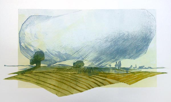
Fen Skies Series: Squall

You’ll notice that I’ve used a brush to put rain into the print. Normally I work with rollers on lino. This time I used a damp but bristly decorator’s brush and swept the ink onto the block before printing it immediately. The trick is to confine yourself to simple bold strokes; the moment you get fussy you lose the definition of the brush stroke.

You’ll never produce an identical edition this way, but that’s never bothered me particularly: the weather’s never the same two days running, so why should my prints all match?

On the beach

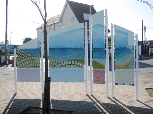
Last month my first town sign went up in Leysdown-on-Sea on the Isle of Sheppey. This engagingly quirky and very traditional seaside resort’s been having a bit of an ‘art’ face lift and my three metre high enamel sign was part of the revamp. I’ve nothing against village signs, well, nothing unless you count the fact that they are often produced in an off the peg format and style which bears absolutely no relation to the spirit of the place. Rather like a funeral I went to where the deceased was praised for her enjoyment of classical music, but no mention was made of her breath taking talent for playing the spoons…

Not so Leysdown. For a start I was damned if I was going to produce something rectangular. Actually I would have been damned as a rectangle the size I had in mind wouldn’t have fitted in the furnace (an essential part of making vitreous enamel signage). I’ve worked many times with enamellers AJ Wells and Sons and between us we came up with a way of turning my idea for an arching segmented artwork into a practical and cost effective sign, immune to the attentions of excitable holiday makers on a high season Saturday night.

Front
Front

Imagery was easy: Leysdown’s the sort of place you visit with your Nan, catch crabs on the beach and get to stay up past bed time in the arcades. I adored similar holidays on the Lincolnshire coast as a child. I worked with writer Mark Hewitt and together we came up with a visual and verbal description of the town; caravan sites, wind farm and all. I believe in telling it how it is – the caravans are what makes Leysdown and they feature as a pattern across my sign. As far as I could see, each one had a family inside having a good time and that’s something to celebrate not belittle.

Back
Back

This is the first time I’ve used silk screen alongside hand painting. The front of the sign is mostly silk screen printing by my mate Ian at AJ Wells who makes it all look easy. Then, holding decorator’s roller trays like paint palettes and glossing rollers like brushes, I painted the seascape, the caravans and the landscapes.

I hope the locals like my sign and that they see it for what it is: a tribute to the kind of holiday destination that made for some of my best childhood memories…

True Grit

Preparing your lino.

reduction linocut

It’s not often these days that I make a breakthrough rather than a series of small adjustments in improving my lino cut. This breakthrough is so modest, simple and, now I think about it, so embarrassingly obvious that I am pretty sure most people do it already: it’s to sand the lino before using it. Give lino a very gentle sanding with a fine paper, I use the black wet/dry 600 (dry), and printing large areas of perfectly smooth thin, thin ink becomes a doddle.

Thin, thin ink is rather important for my kind of printing: I usually go to six or seven layers of colour and because I use my dip pen drawings as my pattern to cut, there’s usually a lot of very fine detail. The gloopier the ink, the more detail goes and the messier everything gets. My friend and fine printmaker Ian Phillips mentioned the business of sanding as a throwaway comment and he’s changed my life. Well, not my life; the house still needs cleaning and there’s no masseur available on tap, but it has improved my printing no end.

The other bit of preparation I find helps is to rub a bit of colour into the lino: cutting through a colour (I usually use red) into grey is so much easier than grey on grey and somehow much more satisfactory.

The print here is inspired by a poem by Carol Ann Duffy about Red Riding Hood. The connection is loose to say the least, I’m taking part in an exhibition for World Book Day next year and this is a possible entry. As you can see it is layer on layer and registration is critical. I also use cobalt dryers to speed up the drying of my now exquisitely thin ink layers. Cobalt dryer is a pretty purple liquid which I add in tiny drops to the inks (it doesn’t affect colour at all) and instead of my waiting around for days between layers, I have only to hop from one foot to the other for a few hours before I’m printing again.

Words to the wise about this sanding business though – do try and remember to do it before you do the master drawing on the lino block. I was in peril of scraping off all my pen lines on this one…

Paper Chase

I’ve been teaching summer school at Oxford Brookes Art School (which incidentally smells exactly like my old art school, whipping me back to a time when I lived on iced buns and lived for printing big linocuts of Aberystwyth’s distinctive architecture and town life) and one of the questions that kept coming up was ‘what paper do you use for printing your woodblocks?’.

The answer is that I haven’t settled on a paper in the UK. As I write there are rolls of paper about to be launched onto the high seas from Japan for me, but in the meantime I am using 200g Fabriano. The paper I was taught to use was washi – a long fibre mulberry bark paper – and, fatally, we were taken to the factory where the highest grade handmade washi is produced. Thanks to the usual extreme Japanese generosity I was given paper and unwittingly printed away, not realising that I was being ruined for life and that no paper I can afford in the UK would ever compare.

Fabriano 200g does work well, but I have found that it needs sizing with alum first. The alum acts as a mordant, making the colour more brilliant. I discovered a document about 17th century western paper making (I admit I was stumbling rather than engaging on personal improvement through rigorous research) which pointed out that the very same alum mordant used to prepare wool to accept dye would improve the appearance of watercolour on paper. Since I spin and occasionally dye my own wool this all made sense and, even better, I had the alum* to hand so was able to plunge into a series of experiments. My semi-scientific (I was wearing surgical gloves and a very inky lab coat) findings are that 32 – 64g of alum per 500ml water improves the colour brilliance no end.

Try it yourself. I should warn you that you shouldn’t get the stuff on your hands or in your eyes or stomach. Mind you, my mum used to lean over the kitchen sink and burn out her occasional mouth ulcers with neat alum. She swore by it, but I only ever did it once: it worked well, but felt exactly how you would expect burning a mouth ulcer out with acid would feel. Not a cheering experience.

*use Aluminium Potassium Sulphate and not Aluminium Sulphate as the latter is not as good for the paper as the former. You will find the powdered alum through any textile or wool dying suppliers.

Free for all

I am currently at the mid point of my Open Studio event. I’ve been opening up my studio for the last four or five years, allowing the public to arrive at will and experience a working print room. This is the first year I have opened for every day of the fortnight and it’s a mixed blessing: on the one hand it’s great because it pins me down in the studio all day and on the other hand it’s rotten because it pins me down in the studio all day. I am suffering from cabin fever. Suddenly the thought of going to the supermarket with an optional visit to the dry cleaners seems as seductively exciting as a trip to Monaco.

On the plus side it is making me get on with my work, though in fits and starts depending on who arrives and what they want to see. I feel there’s no point in having an open studio if people can’t see work in action and talk to the artist, pick up tools, handle the prints and ask all sorts of questions. The questions are interesting and range from the highly technical (a retired engineer interested in the inside specifications of the Albion Press) to the ghoulish (small boy ‘are those tools sharp enough to cut you so it wouldn’t stop bleeding until all your blood ran out?’) and sometimes to the plain well, plain: ‘how much money does this make you?’.

On the whole I enjoy this hiatus in the solitary time I spend with Radio Four and now with Radio Four Extra. Printmaking is such a blend of craft and art: it’s a bit of theatre with plenty of opportunity for thrills and surprises, the dark tragedy of the misplaced registration and the joy of peeling back the final perfect impression. It’d be a shame to keep it to myself all year.

Apron Strings

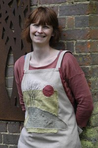
Laura wearing her Marketing Pinny
My American friend Betsy thinks it's great that we should call this a 'pinny'

This is my ‘printing pinny’ with one of my landscapes sewn on the front. I came up with the idea because I’m often at shows and fairs and I want something that says who I am without slapping a big badge on my front. I’m going to be demonstrating at Art in Action this year; it’s a big festival and the print marquee (as I recall) is hot, crowded and confusing. It’s hard to see the artists from the audience sometimes; one year I asked a charming man all about woodcut tools and, after answering me at length, it turned out he was a fellow visitor (albeit a printmaker). So apron plus landscape hopefully equals working artist plus identity…

There is a bit more to it than that. I grew up with a mum who was a professional dressmaker for a while and a brilliantly good seamstress. She didn’t cut my sister or I any slack and we both learned to sew early. This developed into quilt and collage making while I was running a business and, if you look at my prints, actually forms the basis for how I see landscape: the sky is often a backing cloth for the land. So the apron is just a dip back into the past for me and was such fun to make.

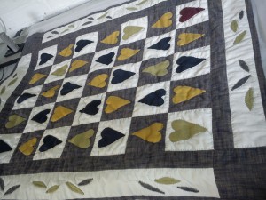
I do still make the odd quilt by hand. I made this one for my new great niece Millie in Australia – something traditional from the old world for a new world baby…

Millie's Quilt
Millies Quilt

Those who can’t…

‘Those who can’t do, teach’ – right? Teaching gets a bad press over here: seen as something an artist is forced to do to finance the creative process at best. At worst we’re teaching because we’ve failed to make it at any other level. So wrong in my opinion, especially after eight weeks of learning in Japan

As an artist, one of the greatest tools I have at my disposal is the opportunity to teach. How else will I get to work with such a diverse crowd of adults and children, all with ambitions, images, ideas, talents so very different from my own? The fact is that I have never taught anyone from age three up who hasn’t had something interesting to say through their work and their approach to printing. To work well I need to be teetering by the toes of my plimsolls on the wrong side of my comfort zone and it’s my students who help to get me there. Left alone, it’s me and Radio Four and no challenging ‘why’ or ‘what if’ or ‘how’ questions.

Japan is different. Teaching in Japan is seen as the art, the finished work is the by-product, and the more I teach the more I see why, though in truth I still see art as the art. With every group of students that leaves me clutching their prints and new found knowledge, the richer my work is for the exchange. I am glad that I have the knowledge to train others in the print process and to do it well: it’s for my benefit every bit as much as theirs.

‘Those that want to move forward, teach’ is the way I see it.

I’m teaching Japanese Woodblock at Oxford Brookes and at Missenden Abbey this summer. There are a few places still available, follow the links on the workshops page of my web site.

It’s not all about me

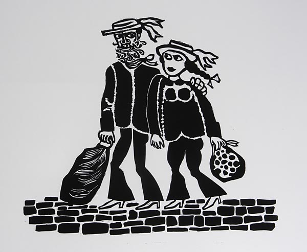
A couple of weeks ago I printed this linocut for my mother-in-law Sal. It was cut by her dad, Jim Boswell, who was a significant artist and illustrator. He was also, by all accounts, charming, funny, badly behaved and immensely engaging to know. It’s one of my great regrets that I never knew him in person, though I know him well through the many paintings and illustrations we have on our walls. I’d have liked his help and advice, which I know would have been good and, most of all, I would have liked his approval. Having Jim’s endorsement of my work would have meant a great deal.

Jim Boswell's Linocut

I was lucky enough to know his wife Betty, a woman of great good humour and resource. She had the wit, during rationing, to whisk away Jim’s Communist Party protest banners (which he had painted enthusiastically scarlet) and boil them down into suitably pink nightdress material for Sal’s boarding school wardrobe.

This print is very simple, it was done for a record cover (I’m guessing folk music, probably sea shanties), and easy to print on my Albion. Linocuts are like fingerprints: no artist cuts a block in the same way and to ink up Jim’s block was to get that little bit closer to knowing him better. It’s not a great print, certainly not one of his best, but it’s another piece in the puzzle for me. It’s also made me wonder about my own blocks: will some distant relative inherit them? I pity anyone who has to work out my woodblocks which are a maze of multiple blocks on both sides of the same wood (I learned to be thrifty in Japan and will put work wherever there is space). There’s not much hope for the lino either: my blocks are mostly destroyed as I cut away with every layer of colour I print. No point worrying though; I shan’t be around to care!

The Big One

Since 2009 I’ve had a 5m high and 140m long painting on exhibition in Aylesbury in the form of my street length enamel landscapes. People in Aylesbury know it well: they have no choice, they have to walk the length of my artwork to get to the train and bus station. My problem is showing everyone else. It’s impossible to squeeze even a sixth of it into one photo.

The first twenty meters

Finally we have a solution – a virtual walk along a massive composite picture of the whole thing and it is now on my web site. I won’t even pretend to understand how my husband Ben and brother-in-law Simon got the pictures taken, sorted and coded to make it happen. My technical involvement (apart from painting the thing in the first place) was to hold up a bit of white card at intervals and be photographed for colour balance. I’m also in the picture: once when I knew I was being photographed and look fairly civilised and a couple of times where I’m bored, cold and clutching a copy of the Sun that I found in a rubbish bin…

The virtual walk gives me just enough distance from reality for me to stop agitating about things I might do differently now and see the project for what it was: a brilliant risk that came good. It’s also an awful lot of happy memories of friends made, laughs had, early morning starts and late night finishes fired into each and every panel.

Do go and take a walk.

Stop Press

It’s always a pleasure to teach a skilled printmaker and I spent a day last week with Annette Sykes one to one in my studio while she got to grips with Japanese woodblock. We met in a hot tent at Hatfield where we were both demonstrating. Like me, she loves her lino, but, like me, she was immediately seduced by the possibilities of water based woodblock printing: no press, no size restrictions and a whole world of texture to explore.

I gave Annette a run for her money: she designed, cut and printed her image in the course of the day, but I also made her try some alternative types of timber. I don’t fancy the chances of her husband’s workshop surviving her enthusiasm for the raised grain of weathered timber. She’ll be filching wood at every opportunity just like me. I shamelessly helped myself to a chunk of unseasoned eucalyptus the size of a small child from a friend’s woodpile last week – I fancy cutting a rough monochrome landscape in wet wood – shouting that I would give them a print as the car buckled under the weight (they had some chestnut too which they foolishly let me see).

Annette did have a hitch when she got home; enthusiast that she is, she plunged straight back into printing. Having learnt from me to damp her printing paper in newspaper, she, like so many before her, fell foul of the Daily Mail. I neglected to tell her that I use old paper. My copies of the Guardian come via my family. They read it and then either I get it and it contributes to the creative arts, or their neighbour gets it and it’s dribbled on by their elderly Labrador. Point is that my old stuff doesn’t offset while Annette found unwanted coalition news on her printing paper thanks to a Daily Mail fresh off the press itself. Yet another note to add to my take home fact sheet. I can’t see it holding Annette back for long though…