Laura Boswell ARE – Printmaker

Chop and Change

How sketches turn into prints

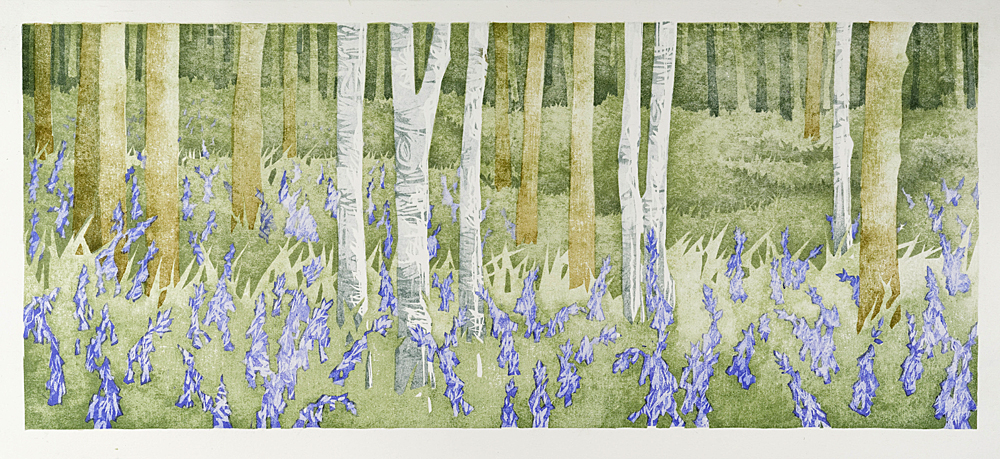
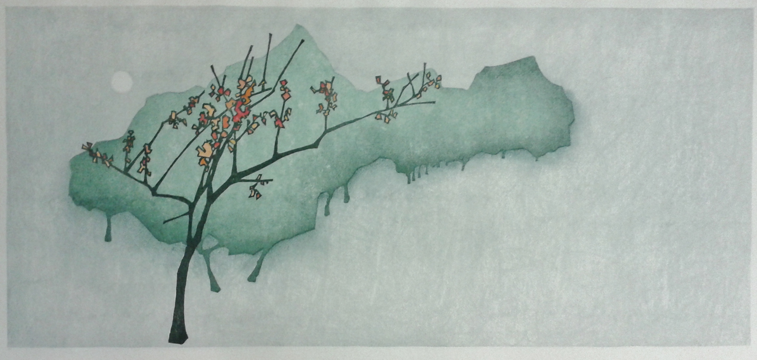
I’m often asked about my sketches and how I turn my ideas into a finished print. I always feel a bit awkward about this (it’s uncomfortably close to the ‘what music do you like?’ question which I dreaded as a teenage devotee of voice radio). For me, it’s a vague process at best; leaping from a few pencil lines to the full size template drawing for the block with nothing in between. Like most worriers, I suspect there is a party going on in the next room where artists in the know have exquisitely pleasing sketch books with annotations, fold out bits and delightful little objet trouve. Somehow my works on crime novel and thriller fly page seem sketchy beyond the point of sketchy, but they work for me and will make for an uber-cool retrospective if they haven’t gone off to Oxfam for re-reading.

The drawing and planning comes with the print sized template drawing. These days all my drawing is done in outline with no colour. I only shade for planning purposes, not visual effect.

full size template drawing

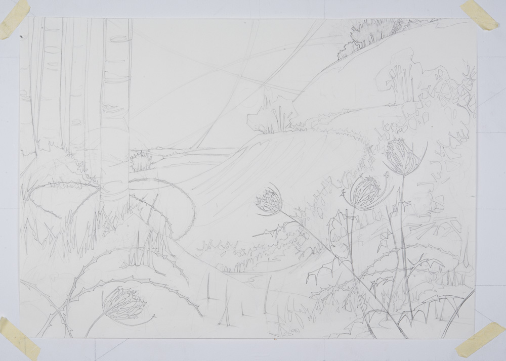
The upshot is more blueprint than charm and I simply draw, erase, draw until I am happy. I tend not to make more than one drawing, unless I am trashing it for a new start, as multiple efforts quickly lose their life and freshness. Since I arrive at my shapes by scribbling and then refining, the result is ‘architect meets infant scholar’. Neat drawing, but the paper a lumpy mess of rub outs and corrections.

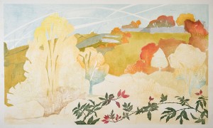
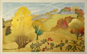
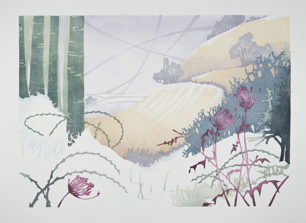
I do proof my woodblocks. Below you can see the proof for ‘Chiltern Seasons: Winter’ and play the spot the difference game with the final finished print.

proof print
proof print

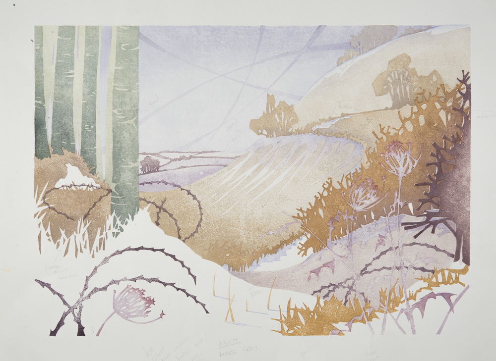
See how many blocks I’ve cut and then discarded. Less is often more and I discard blocks and simplify the print far more often than I cut extra ones. The colours too are very different as you can see, though I never make rigid colour plans for either proof or edition, I just see the proof problems and address them as I go along. Proofing is also a chance to see if the blocks line up correctly and, if they don’t, it’s best to get the crying done over the cheap paper.

Finished Print
Finished Print

The journey from idea to print is different for every printmaker and I’m sure that there isn’t actually a rule book demanding a set route for the journey or means of travel. So I choose the Star Trek transporter method of arrival at finished work. Beam those prints up Scotty!

If you go down to the woods today…

Reduction Japanese woodblock printing experiment.

Bluebells, Wet Spring, now available in my gallery

I often get asked about the difference between a reduction linocut and a Japanese woodblock. Reduction prints (apologies to those who know) are created from a single piece of material, the block being cut each time a colour is printed. As the picture develops so the block is destroyed. The process depends on a build up of ink, one layer on top of another and the entire edition must be printed at the same time. Japanese woodblock depends on the transparency of watercolour and so the print relies on a jigsaw of individually cut blocks which fit together, rarely overlapping. This preserves the brilliancy of the delicate colour and the editioning can be done in stages.

Of course things don’t have to be that simple and this summer I decided to mix up my approach: pushing Japanese woodblock to perform well using the reduction techniques I normally reserve for lino. I wanted to layer watercolour to see if I could exploit its transparency without losing its brilliance. I also wanted, and here’s the honest part, to complete a very complicated picture without cutting a huge number of blocks (huge is a relative number, I did still need to cut an awful lot). Besides I’d spent the whole of my open studios bigging up the print with all the enthusiasm of Kim Kardashian’s publicity team. Whole families signed up to my mailing list on the strength of seeing the finished print alone, thrilled by the prospect of all that ugly splintered builder’s ply morphing into the quiet beauty of a Buckinghamshire bluebell wood. (To watch a short film about this print click here)

So here it is, my ‘Bluebells, Wet Spring’. A print with multiple overlapping wood blocks, some printed as reduction. It is printed on heavy, blanket soft Fabriano Rosaspina paper which I have sized with a mix of fish glue and alum. The size hinders the paint so I had to use more strength than usual to print, forcing the watercolours into the paper. The trade off is the grainy effect of old fashioned fast analogue film which I think perfect for this particular image. By layering four different background blocks, each one reaching up to the top of the image, I’ve arrived at an increasingly ambiguous background. Normally a recipe for muddy disaster, it is this layering of green watercolour on watercolour that allowed me to play with building up the particular sappy, lush feel of a wet spring wood, misty and undefined.

I’ve also varied the tree trunks by cutting some out in some background layers and not in others while yet more are overprinted onto the background individually. Hence the mix of densely printed trunks with those that only have one or two layers of colour. I kept the silver birch trees entirely free of background paint, printing the grey bark in layers as a reduction onto the white paper, chopping into the woodblock for each layer. The same goes for the bluebells. Cutting bluebell shaped holes in exactly the right place across three of the four background layers is every bit as engaging as it sounds, but worth it in the final print; allowing the pure lavender blue of the bells to hum against the green background.

Did I plan all this? Only in so far as cutting the blocks and having a mind’s eye view of the finished image. Colour I always take as it comes, preferring to make my choices as I go. You can see that by the lack of it in my drawings and the difference between the proof and the print. Luck also comes into it: I’d run some tests on the rosaspina paper and had been annoyed by the result at the time, but remembered it and realised it was the very effect I wanted here. Did I appreciate how much my feet would ache by the end of printing the whole edition in one shot over three very long days? Not at all…

Don’t try this at Home

Mounting Japanese woodblock prints and what not to do!

So, what do artists do all day? I’ll give you a snapshot into this morning…

Today I discover that an experiment I made in backing a pair of prints with a sheet of paper to unite them flat for framing has sort of worked. Sadly the bit that hasn’t is quite important: the prints are desirably flat, but the backing paper is now tightly bonded to the glass sheet I used to support the experiment.

This is a bad thing, but not insurmountable. True these are finished prints and they are now stuck fast to the wrong thing, but they are Japanese woodblock prints. This means I can sit at the kitchen table with a bath sponge and a bowl of water and dab them until the whole thing is wet enough for me to release. Japanese watercolour and rice prints look delicate, but take damping and re-damping with the insouciance of the British at a bank holiday barbeque. I have two more sets of prints to go and another avenue of mounting needs exploring.

I learned the art of backing prints with supporting paper while on residency in Japan. Imagine the scene: a big room empty but for tatami mats and sliding paper screens, Mount Fuji at the end of the garden and students kneeling attentively (this does not include me. I cannot kneel and used to carry a note excusing me from kneeling in infant school. I stand respectfully instead). What the master says makes absolute sense and we accordingly mount and back prints successfully. What doesn’t translate, once I am in my own kitchen, is the access to the right brushes and papers. Here I am lacking in wide hemp, rabbit and deer hair brushes and the easy availability of washi paper. My prints are on European paper and I have emulsion brushes from the builder’s merchants. It’s now a question of adapt or fail.

This time I decide that the glass is best lined with cling film to prevent the backing sheet from sticking. I have seen Masterchef: I know cling film has diverse uses. First I wash the big sheet of picture glass in the bath to remove the last batch of gummed paper. As the glass slips around, I consider the health and safety forms I’ve just filled in for a class I have to teach. They require me to warn students not to trip over their own belongings. Nowhere do they cover the stupidity of juggling large sheets of thin, wet glass in a hard, curved bath.

I and the glass survive. Lining with cling film goes well, but then I worry the gummed tape to stretch the paper won’t stick so resolve to cut the film to the size of the paper to expose glass to the tape. For some reason I choose to use a meat cleaver for this (I am in the kitchen after all). More suited for a father intent on discouraging his daughter’s admirers, it actually works a treat and I am able to put fresh paper onto the film on the glass, damp and stretch.

The prints need to be stuck down with rice glue. I’ve made the glue by beating the hell out of a stiff rice and water paste for a full half hour over high heat while wondering if this is for the glue’s improvement or mine. Traditionally the resulting rubber ball is then diluted again by working with a hemp brush. I use the milkshake option on the blender. The cat appears and walks about on the prints. I shut him out. He swings on the door handle and yells, so I stop and place a chair in the sun where he agrees to sit and assumes the expression of Prince Phillip watching some not-so-good tribal dancing. I coat the back of my second batch of damp prints with the rice glue and offer them up to my scrupulously drawn guide lines more in hope than expectation. When they were handing out accuracy, I veered off course into the queue for creativity. I do my best, seal everything down and leave with the cat to dry in the warm.

It’s not yet nine am. This is a pretty normal day for me and I suspect for a lot of you creative people. It’s what we do and, though it’d be nice if things ran to plan, I do like a job that keeps me on my toes…

Touching Up

Polishing Japanese woodblock prints.

The subject of touching up is always a bit controversial even when, as here, I am referring to prints rather than people. It is something my students tend to discuss between themselves in whispers as though expecting me to descend on them with a cane if I were to catch them at it. Far from it: I do it myself.

There are plenty of purists out there who apply rules to the making of art and craft. Some of those are quite rightly maintaining guilds and official standards – botanical painting springs to mind. Others just want to keep things ‘proper’. The latter always make me want to be as improper as possible. I had a meltdown in a marquee once when some ladies told me that I ‘couldn’t’ spin wool the way I had learned in a croft on Islay (and how proper an apprenticeship is that?) because it wasn’t the way they did it. I may be doing it wrong, but my jumpers seem to work OK…

Japanese woodblock with some hand colouring

In the small world of my studio, I believe that as long as whatever you do doesn’t affect the archival integrity of the work, then it’s all fair game. To that end I blot off marks, correct coverage by painting with the pad of my fingertips, touch up with brushes (sadly this latter is almost impossible with Japanese woodblock and, interestingly, vitreous enamel. Both being too sensitive to hide that sort of correction) and generally do what I have to if I think it will improve the result. I also mend woodblocks with filler and glue when I get the chance. Lino is not so cooperative to repair, making it swings and roundabouts in terms of touching up prints.

I also hand paint certain parts of prints sometimes and this picture is an example in point. I wanted some of the leaves to have gold on them so I have dropped it in with a brush. I’m OK with that, though purists would argue that a Japanese woodblock should only be printed. Actually, I think the Japanese are great pragmatists: they printed every detail during the Edo period because they were mass printing for a client, not working on personal limited editions. I would hazard a guess they would touch in colour if it was the practical answer.

The conclusion I’m aiming at is that I never feel bad about touching up and corrections and I strongly advise students to make this a practical part of their knowledge. Maybe when I get on in years I will end up in a tent telling people that they are doing it all wrong, but I don’t think that’s likely. I’ll probably still be in my studio breaking the rules myself…

Behind the scenes

Registration problems, sometimes it all goes wrong…

Like most people, I do try to present a fairly polished front to the world when it comes to my work. Certainly I do my best to be organised and efficient at the admin end of the business (investing in a desk and a filing cabinet has been a revelation and I am pathetically thrilled by having a basket on my desk with stapler and sellotape to hand. Scissors still elude me despite bulk buying, but we can’t ask for everything…)

The upshot of all this is that I tend to only show the good bits of my work: the neat little sketches with potential, the studio shots where I look in control and am not squinting at the camera in a confused leer and, most of all, finished prints. For a change I thought I would show you some heart ache. Things don’t always go well and this print has been a really good example of what can go wrong. Inevitably this was the last print in the series of fourteen due for my client with a deadline looming and almost as inevitably I developed a head cold featuring a dangerously drippy nose at the same time.

working proof showing how things shouldn't look
working proof showing how things shouldn’t look

Japanese woodblock relies on a series of registration slots called Kento. These slots are cut by chisel onto the wood along with the block for printing and are crucial to lining up all the layers of the print into a full coloured picture. They act as a guide and the printing paper fits into them and is held in place to take the impression. Get any of the Kento slots a couple of mm out and the picture will be wonky. The print here has 18 different Kento slots (some of the blocks share a Kento, there are roughly 45 to 50 different woodblocks for this picture) and somewhere along the line I was out of sync.

Trouble is that it isn’t until I start printing that the problem becomes clear and even then it is seldom obvious just which kento is the problem and with several blocks sharing a kento, it could be just one of them that is out of line. The paper doesn’t make things easy either: it must stay damp, consistently the same damp, or it changes dimension. The bigger the print, the bigger the distortion. This print is 120cm wide and the paper can change by as much as 4mm as it dries. It’s easy to control if all goes to plan, but have a head scratching crisis of alignment and the paper is against me, drying out as I try to see the break in the chain of Kentos and adding to the confusion.

In the end I did manage to get a finished print without the benefit any drips from my leaking nose, but it was a nightmare.

DSC_0234I would love you all to think that I have everything under control and things always go to plan, but it’s not the case. I do get caught out, as I have here, and I am far from perfect. It’s just that I tend not to talk about it much!

Anti-Wrinkle Treatment

Getting your Japanese woodblock prints to dry flat.

Paper has a hard time in my hands as a printmaker. I put it through all sorts of stresses and strains on the way to making a print and still expect it to finish up as a pristine, flat sheet of loveliness at the end, though hopefully with a layer or two of colour on top.

Oil based lino prints aren’t a problem. I’ve been doing them a long time: I use Zerkal paper (like most of the printers I know) and it works a treat, staying nicely flat under the pressure of my Albion press. The clever bit for me here is keeping my filthy hands off the edges of the print.

The Japanese printing I do is a whole different story: this is a watercolour process, the paper is damp and I am constantly stretching the paper with hand rubbing in different places. The Fabriano I use, while very good tempered about taking the paint, can be very hard to dry flat, especially if the print is large.

I have very recently, after lots of stacking and balancing acts with everything from those big cookery books, the sort with just the one great recipe, to old bricks, discovered a way to resolve the problem. I now use two large sheets of birch carpenter’s ply held absolutely tight together with butterfly clamps. Butterfly clamps are a builder’s equivalent of a peg, but massively stronger and much larger. I bought mine off a puzzled man in my local market at £1.50 each. They have rubber over the gripping mechanism which protects the ply should you later want to turn it into a woodcut. Buy plenty: the more you clamp, the better.

I put my damp prints straight onto the clean ply and put another sheet over the top (this is 5mm thick ply, it’s probably best to have it fairly sturdy) and simply clamp all the way around with my butterfly clamps. It takes about two days or so to work and the prints are beautifully flat at the end. The ply absorbs the moisture, then dries out and off you go again, though you must keep it clean. Keeping anything clean for me is a major challenge which is why I go on about it so much.

There is another very occasional problem and it’s pretty much out of my control: pictures getting damp in frames and then coming back from wherever they have been shown cockled. These wrinkly prints can be both linocuts and woodblocks. With these, after stomping about a bit in temper, I remove from their frames and make up a sandwich of slightly damp blotting paper. I put the prints, oil based lino included, into the blotting paper parcel and allow the prints to get damp for about 4 hours or so. At this stage they become alarmingly wrinkly and look terrible. They then go into the ply and I dry them as before. The result is again a lovely flat print.

I can’t promise that this will work well for every sort of print, you’ll have to try it for yourself, but it certainly works for me…

Colour coded

How to handle your pallet on many layered prints

This weekend I spent printing one of my fourteen giant watercolour woodblocks for the Health Centre on the Isle of Wight. It was never going to be easy: Japanese watercolour woodblock is really designed for perhaps A3 or less, not for over a metre wide. However, the medium does, provided your nerves are steady and your arms long, allow for printing on any scale as there is no press to limit size.

West Cowes, Isle of Wight

The main thing, in my opinion, is to get the colours right. No good having a foreground dislocated from the background or lose the sense of distance in a squash of mismatched pigment. I’m stuck with doing this in my head as I go along because I find that the more I plan, the more the life of the print seeps away. To this end I have many, many little glass tea light holders (thank you IKEA. And while I mention the Norse god of home solutions, you can buy sheets of heavy glass with ground edges, perfect for mixing inks, for a song at IKEA just now. Just look for ‘Malm glass top’). The holders are filled with what my lovely Irish father-in-law describes as ‘Laura’s designer sh*t colours’. They get gradually more and more mixed up as I go and result in what I hope is a subtle print of correctly balanced colours. Not so easy this time with dozens of separate little abstract shapes – is it a bird, is it a plane? No it’s the back of a warehouse… You get my drift.

I do test colour and the way to do this with a Japanese print is to take a test sheet of paper (you will of course keep all the trimmings from cutting down your papers to size. Also good for posh shopping lists and guaranteed to impress when you go to pick up your sushi ingredients. Believe me, the Japanese will notice). Put a blob of mixed watercolour on one side of the paper. Take your finger and smear the blob across the paper. It is the smear, not the blob which gives the true result. You also end up with a neat reference sheet which, if you are a better person than me, you could make colour mix notes on as well.

There is a partner to the print here of West Cowes. No prizes for guessing that’ll be East Cowes and for that I have to echo the colours, though not in the matching handbag to shoes way. That would be too obvious. The trick will be to get the pictures to relate, not match. The good news is that there are fewer warehouses on the East Cowes side…

Home Cooking: Nori Rice Paste for Japanese Woodblock

a blog.

Rice paste, called nori, is an essential part of water based woodblock printmaking. In Japan nori is a pretty universal substance used in all sorts of ways from laundry starch to safe glue for infants (eating glue must be a common problem, I certainly ate glue at my kindergarten – it tasted of almonds, yum). It can be bought everywhere and is dirt cheap.

applying white nori to the block for printing

Imagine my dismay when I came home to find that here nori is a rare and expensive thing. It was like blundering into the the fifties and finding that olive oil was back in Boots in 4oz bottles. Concerned and mean, I looked for alternatives.

The traditional recipe involves a lot of soaking, grinding and pushing of reluctant gloop through muslin. About 10% made it into my nori pot and seemingly 150% splattered the kitchen. Then I found a recipe suggesting rice starch – taa daa! Five minutes on the internet and I had a kilo and a half of fine milled white rice flour (turns out I bought enough flour to keep Hokusai’s print shop in business for a year, but it was so very cheap)

The recipe follows, it’s dead easy, takes about ten minutes and you can wean a baby along with printing if you wish. It’s only rice and water so has no preservative. I’ve done the experiments and can tell you that it doesn’t freeze (turns into water and a lump of something very odd). It’ll keep for about four days at British warm for spring temperature before going watery, at five days it’s got a fur coat. In the fridge it will last a week.

Mix 20g rice flour with 100ml of cold water
Stir until smooth and milky
Bring 150ml water almost to the boil in a pan
Add the paste mix in a smooth ribbon and stir
Bring to the boil and keep stirring constantly until the mix goes translucent (about five mins)
Cool, stirring from time to time

This excellent recipe comes from ‘The Art and Craft of Woodblock Printmaking’ ISBN 951-558-085-4