Usually I try and keep things short, sweet and not too technical. This blog breaks the rules and is more of a report to compare oil and water based inks for lino. Not your bag? No problem: I’ve seen my friend’s eyes glaze as I feverishly discuss this kind of thing with a fellow printer. Do what they do – go have a coffee and leave me to rattle on!
Up until a couple of months ago, I have always used oil based lino inks for my reduction lino printing. I’m not one to be unduly anxious about chemicals. Personally I have never had any ill effects from splashing about with white spirit and cobalt driers. I don’t actually drink or inhale the stuff and, while it’s not exactly what Estee Lauder would have recommended, my skin is fine.
Now I am having a serious flirtation with water based inks. This has to do with the long cold winter. Frankly, the attraction of shivering my way down to the studio and smashing the ice on my water bucket every morning wore very thin, very quickly and along with that, I grew deeply tired of rolling out inks so seized with the cold that they were almost impossible to handle.
Water based ink doesn’t suffer the same problems, if anything, it is disconcertingly fluid. There are a few other differences too so in the interests of anyone who hasn’t yet decided which inks are for them, here’s what I found.
I use Zerkall paper for oil based ink. It’s a good quality good-natured paper, readily available in different shades of white and an affordable choice. I found it tended to cockle with the repeated application of water based ink and even seemed to stretch a bit at times. For water based ink I now use Fabriano Rosaspina which is a much heavier weight printing paper with a soft absorbent surface and almost card-like feel. This works very well with water based ink. On my Albion press it has a slightly embossed appearance that I really like.
I use Intaglio’s oil based relief ink which works well for me. In going over to water, I chose Graphic Chemical inks. These are closest in texture to oil based ink and are available in large tins as well as tubes. I was also given a set of Schmincke inks to trial for the company. These inks are much more slippery and fluid than Graphic Chemical and I tend to mix both sorts which works fine (this is just me being pragmatic as I have both sorts to hand). The beauty of both these inks, as opposed to some of the other water based ones available, is that they are cleaned off with a wet rag. I have no plumbing in the studio (only my bucket in the style of Jane Eyre) so cannot be washing with soap. Nor can I risk getting the lino too wet as I always block my lino up to the right height by sticking it to MDF. Anyone who has ever seen MDF get wet will appreciate that it swells with water faster than chick lit in a hotel swimming pool.
When it comes to mixing the water based inks, I find that I need to test them on paper to get a true feel for their colour which can look different on the glass as opposed to on the print; the colour on paper often being ‘edgier’ and more attractive than the ‘pretty’ colour of the ink on glass. I also found the use of white to be very different. With oil based ink, I use white a great deal. However the water based colours tend to go chalky with overuse of white like water colours do. I find myself using extender instead to make the colours paler.
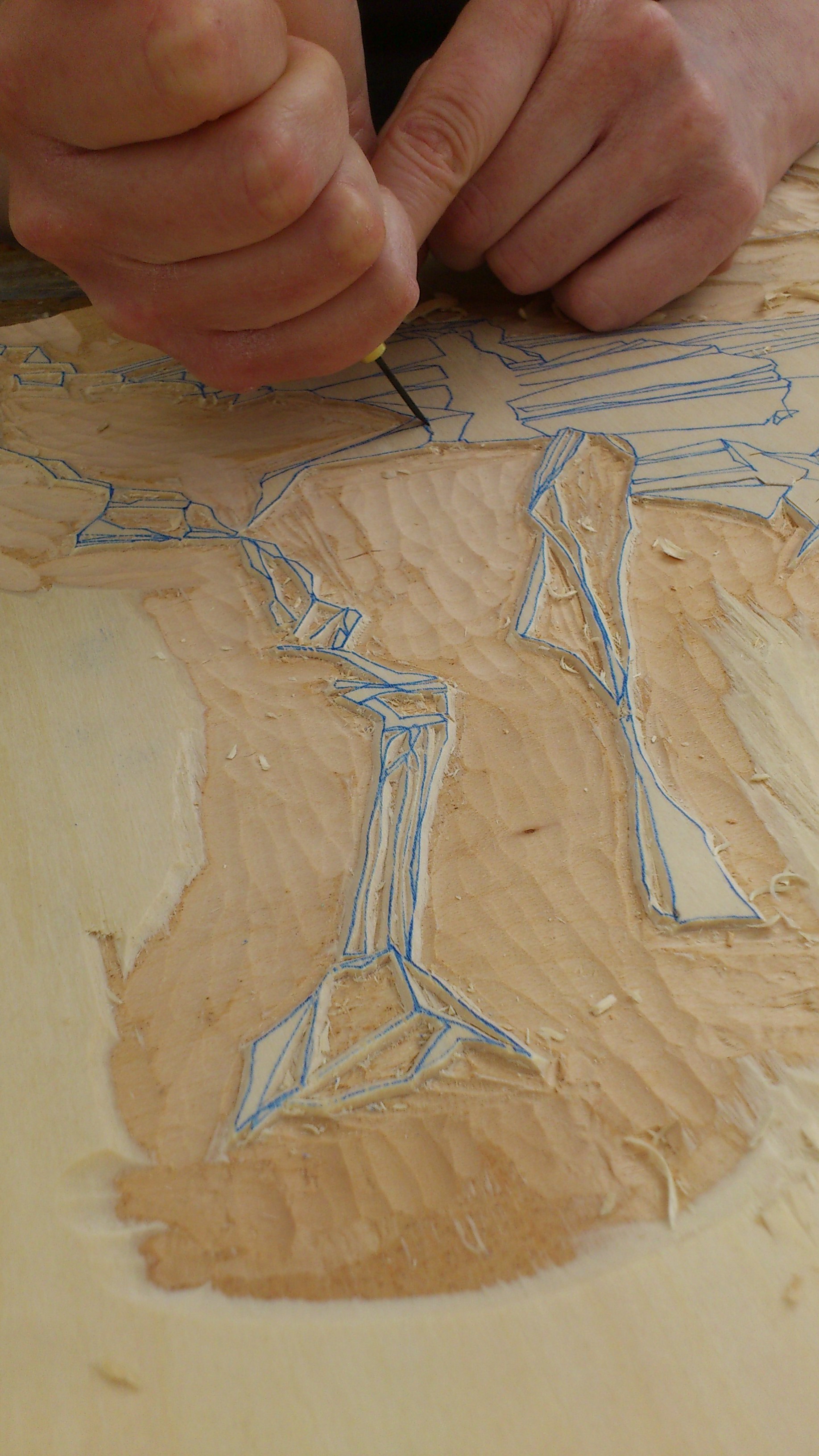
Inking up is slightly different between the two inks. I have good rollers and that’s a plus for water based ink. Oil based will be far more charitable to the slightly naff roller than the more fluid water. Applying oil based to the block is fairly easy to judge, while water based can be a bit of a struggle to get even (though this may well just be inexperience on my part). I find I sometimes have to double print a water based colour to get a good coverage. I also pause for a few moments longer with the pressure on the press to allow the water based ink a chance to absorb into the paper. I often use several different colours and paint freehand onto the lino with small rollers before printing. Oil based colours tend to catch the texture and separate quality of the individual roller marks. Water based inks blend slightly more, giving a gentler texture and more painterly effect.
Water based ink does dry much more quickly than oil (even when the oil based has cobalt drier added), but do be warned that the colour needs time to settle. I have rushed to add a layer to a print, thinking that it was dry, only to find that the print becomes a little blurry. The other problem to watch for is paper tearing. This happens, as far as I can see, when tacky ink is repressed onto the paper in the press. Do make sure you clean off all the ink if you are leaving any areas of lino in contact with the paper that are not inked for the next part of the print.
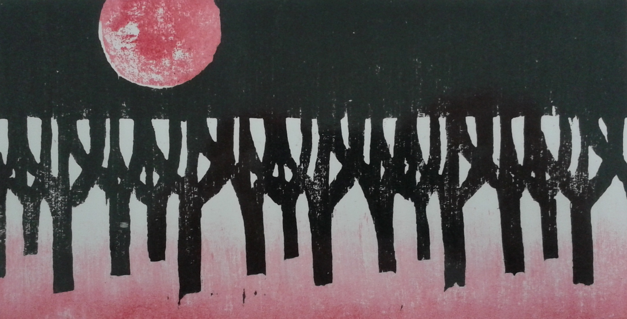
The conclusion I have drawn from all this is that both techniques have their stronger and weaker points. I adore the heavy matt finish of water based ink and the sensual way it embosses into the Rosaspina, but I appreciate the purity and the ease of oil based inks and the simple functionality of Zerkall. If my studio ever does get above five degrees Celsius again then I will probably do most printing with oils and lash out on water based for specific projects.